Shop & Retail Interior Design Guide
Shop & Retail Interior Design Ideas
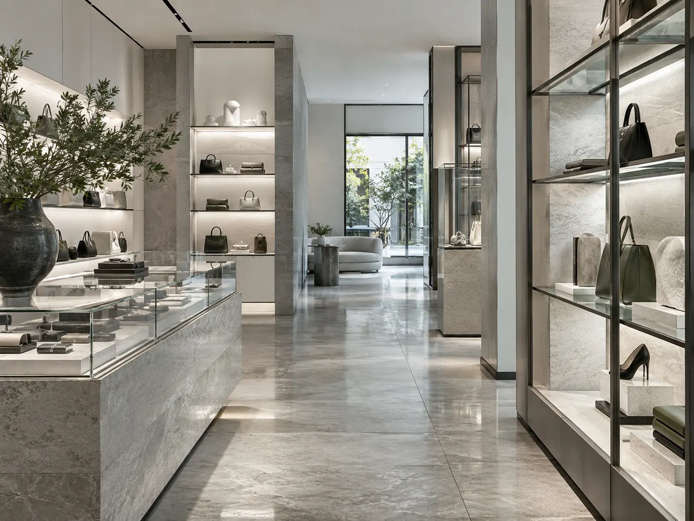
The best shop and retail interior design ideas help customers understand the store quickly, see the right products at the right time and move through the space without feeling crowded: keep the entrance visually clear, create an obvious circulation path, place hero products where sightlines naturally land, use wall displays and central fixtures at the right density, make fitting rooms and mirrors genuinely comfortable, position the checkout where it supports service without blocking arrival, and keep stock storage close enough that staff can replenish the floor efficiently. For a small cloth shop, the priority is not filling every wall and aisle with merchandise; it is using limited floor area intelligently through flexible rails, vertical display, disciplined categories, strong lighting, concealed stock and a few clear focal moments. A successful retail interior should therefore make the merchandise easier to browse and the business easier to operate, because decorative features have little value if customers cannot find products, staff cannot replenish efficiently or the store feels visually overloaded.
This guide covers small cloth shop interior design ideas, very small shop layouts, storefronts, decompression zones, customer flow, garment displays, feature tables, fitting rooms, mirrors, checkout, lighting, stockrooms, materials, brand identity, visual merchandising, luxury retail, UAE shop conditions, budget priorities, common mistakes and decision criteria.
Retail Ideas in One Minute
Design the store around customer flow, merchandise and operations before adding decorative features.
A shop works best when customers can orient themselves quickly, products are easy to compare and staff can serve and restock without interrupting the experience.
Keep the entrance clear
Do not crowd the first steps inside the shop with dense rails or checkout furniture; let customers read the store before deciding where to move.
Create a visible route
Use fixture placement, lighting and product categories to guide people through the store without forcing a rigid maze.
Prioritise hero products
Place new, high-priority or identity-defining merchandise on the strongest sightlines instead of treating every product equally.
Control display density
More stock on the floor does not automatically improve selling; leave enough visual space for customers to understand categories and individual products.
Light the merchandise
Use ambient and accent lighting to reveal colour, texture and key displays while keeping fitting rooms and mirrors useful.
Hide operations
Back stock, packaging, staff items, cleaning supplies and replenishment should have dedicated storage rather than occupying the customer-facing floor.
Idea 01
Start With the Customer Journey, Not the Feature Wall
Before choosing colours, timber, stone or display graphics, map the customer journey from storefront to exit. A typical sequence includes noticing the shop, entering, orienting, browsing categories, interacting with products, trying items where relevant, asking staff for help, paying and leaving. The layout should make that sequence feel natural rather than forcing customers to understand the plan.
Retail design also needs to account for customers who behave differently. Some enter with a specific product in mind and want the shortest path; others browse slowly and respond to displays along the way. The floor plan should support both without making either group feel obstructed.
This is why decorative ideas should follow circulation. A sculptural feature placed in the wrong location can interrupt the route, hide merchandise or create a queue. A simpler fixture positioned on the correct sightline can contribute more to the shopping experience.
Idea 02
Use the Storefront to Explain the Brand Before the Customer Enters
The storefront is the first retail decision customers read. It should communicate brand level, product type and whether the store feels accessible, premium, specialist, youthful, minimal or highly curated.
Keep the entrance visually easy to identify. Signage, glazing, display windows and the door should not compete with each other. If the window display is strong, the interior immediately behind it can remain quieter so the product story is clear from outside.
Use window displays selectively. A clothing shop can show complete looks, new collections or a small number of hero pieces rather than filling the entire window with stock. The best windows create curiosity while still giving enough visual access to the store beyond.
Coordinate lighting with the storefront because a bright shop interior behind a dim display or reflective glass can weaken the presentation. Night-time appearance matters too, particularly where the store operates in malls or evening-heavy retail environments.
Idea 03
Give Customers a Few Steps to Understand the Shop Before Asking Them to Browse
The area immediately inside the entrance should not be the most crowded point in the store. Customers are still adjusting from outside or from a mall corridor and need a moment to understand the space.
Avoid placing deep racks, large promotional baskets or the full checkout queue directly across the entrance. Use the first sightline for a clear feature, category cue or open view into the shop.
In a very small store, this does not mean sacrificing valuable floor area. It means keeping the entrance visually lighter and using wall display or a shallow feature rather than a fixture that blocks movement.
Primary Search Intent
Small Cloth Shop Interior Design Ideas: Use the Floor for Movement and the Walls for Capacity
Small cloth shop interior design ideas should begin with product categories, garment quantity, fitting-room needs and the realistic number of customers the shop needs to handle at one time. The goal is not to display every item on the sales floor; it is to make the available collection easy to understand and easy for staff to replenish.
Use wall-mounted rails, shelves and vertical display to increase capacity without filling the centre of the shop. Central fixtures should be lower or visually lighter so customers can see across the store and staff can monitor the floor.
Group clothing in a way customers can understand quickly—by collection, product type, colour story, gender, size range or another clear retail logic. Mixing unrelated products because a fixture has empty space usually weakens the shop more than leaving some display area intentionally open.
For garments that benefit from touch and comparison, leave enough room in front of rails so one customer can browse without blocking the entire aisle. Folding tables should be deep enough for presentation but not so large that staff and customers have to walk around them constantly.
Use mirrors strategically but avoid creating confusing reflections between narrow aisles. A full-height mirror near fitting rooms or a styling zone can add function and visual depth at the same time.
Very Small Retail Units
Very Small Shop Interior Design Ideas: Reduce Fixture Count Before Reducing Clarity
Very small shop interior design ideas require stricter editing. If the unit is narrow or shallow, every free-standing fixture competes with customer circulation and product viewing.
Use perimeter display first. Full-height wall systems can hold more stock and can be designed with adjustable rails and shelves so the shop changes with merchandise. Keep the centre open or use one compact feature table only where customers can pass comfortably around it.
A compact checkout can combine POS, wrapping and concealed storage instead of becoming a large reception-style desk. If staff can process payment from a smaller counter without compromising operations, the saved floor area can improve browsing.
Use one continuous flooring material and a controlled wall palette so the shop reads as one volume. Too many floor transitions, ceiling features or decorative partitions can make a very small unit feel even more compressed.
- Prioritise wall-mounted display and adjustable systems.
- Keep the entrance visually open.
- Use one strong feature display instead of several small displays.
- Combine checkout, wrapping and concealed storage where practical.
- Use mirrors only where they improve function or sightlines.
- Keep stockroom organisation efficient so excess stock does not move onto the sales floor.
Idea 04
Create a Clear Retail Circulation Path Without Turning the Shop Into a Maze
Customer flow should feel guided but not forced. Fixture placement can create a natural path from entrance to deeper categories, fitting rooms and checkout while still allowing customers to move directly to a product they already know.
Use display direction, flooring rhythm, lighting and category changes to encourage movement. In larger stores, secondary paths can allow customers to explore without returning through the same narrow aisle.
Check the plan during busy conditions, not only when the store is empty. A route that feels generous on paper may become blocked by customers browsing a rail, staff replenishing stock or a checkout queue.
Idea 05
Build the Interior Around Visual Merchandising That Can Change
Retail interiors should support changing products, seasons, launches and campaigns. Permanent architecture should provide a flexible background rather than lock the shop into one merchandising arrangement.
Use adjustable shelves, rails, display plinths and lighting where the product mix changes frequently. A fixed feature can still be valuable at reception, brand wall or hero display, but the majority of selling space should remain adaptable.
Create display hierarchy. Hero products need more empty space, stronger lighting or a clearer background. Supporting products can be grouped more densely. If every shelf is highlighted equally, the customer has no cue about what matters.
Leave enough negative space around important products. Empty display area is not necessarily wasted space; it can make higher-value or new merchandise easier to notice.
Idea 06
Use Wall Displays to Increase Capacity Without Losing Floor Area
Walls are valuable selling surfaces because they can hold product while keeping the centre of the shop more open. Use rails, shelving, peg systems, niches or modular panels according to the merchandise.
Set display heights around actual customer reach and product viewing rather than filling every wall up to the ceiling. Very high shelves may suit display or stock but can be less useful for self-service products.
Integrate concealed lower storage where staff need quick replenishment. A wall can combine display at eye level, merchandising above and stock below without visually revealing cartons and packaging.
Idea 07
Use Feature Tables and Plinths Only Where They Create a Real Pause Point
Central tables are useful for folded garments, accessories, new arrivals or coordinated product stories, but they should not become obstacles customers repeatedly navigate around.
Position a feature table where it can be seen from an important sightline and where there is enough space around it for browsing. The table itself should relate to the product scale; a massive stone plinth can overwhelm small accessories, while a tiny table can make a large clothing collection feel disorganised.
Design for replenishment. Staff should be able to refold, restock and clean the fixture without closing the circulation around it.
Idea 08
Treat Fitting Rooms as Part of the Buying Experience, Not Leftover Space
For fashion and clothing stores, fitting rooms can influence how customers feel about the product. Provide enough internal space for changing, hooks for clothing and bags, useful mirrors and lighting that does not make the customer feel uncomfortable.
Position fitting rooms where staff can manage access without creating direct exposure from the entrance or main queue. A small waiting or companion seat may be useful outside if the customer profile supports it.
Mirror and lighting quality matter. Harsh overhead-only lighting can create strong shadows, while very dark rooms make it difficult to judge garment colour and fit.
The fitting room also needs practical durability. Walls, curtains, doors, seats and hooks receive repeated daily contact, so delicate details should be used selectively.
Idea 09
Place Mirrors for Product Evaluation, Not Only to Make the Shop Look Larger
Mirrors can add depth and brightness, but their first purpose in fashion retail is helping customers evaluate clothing and accessories.
Use full-height mirrors where customers naturally need them—fitting rooms, styling zones or selected sales areas. Avoid placing mirrors where they create confusing repeated reflections or make the store appear to continue into a route that does not exist.
Check what the mirror reflects. A well-positioned mirror can double the visual impact of a strong display; a poorly positioned one can highlight stock boxes, a staff door or checkout clutter.
Idea 10
Use Lighting to Reveal Product Colour, Texture and Priority
Retail lighting should make products easy to see and give the store a clear visual hierarchy. General ambient light establishes comfort, while accent lighting draws attention to windows, feature displays, wall merchandising and selected products.
For clothing, colour rendering matters because customers need confidence that garments look similar inside and outside the store. Fitting rooms and mirrors should avoid harsh shadows and extreme colour shifts.
Adjustable track lighting can be useful where displays move. Fixed decorative lighting can add brand character, but it should not prevent the merchandising team from re-aiming light when product layouts change.
Control glare from polished stone, glass, mirrors and glossy product packaging. The brightest object in the shop should not automatically be a light fitting customers have to look away from.
Idea 11
Position Checkout Where Staff Can Serve Without Blocking the Entrance
The checkout needs visibility, power, data, storage, packaging and enough surface to complete transactions comfortably. It may also be a customer-service and returns point.
Avoid making the checkout the first physical barrier customers encounter unless the retail model genuinely requires it. In small stores, a compact side or rear counter can allow more open browsing while still giving staff useful oversight.
Plan queue space. One or two waiting customers should not block a main aisle, fitting-room door or entrance. Where impulse products are appropriate, use them selectively around the queue rather than turning the checkout into visual clutter.
Idea 12
Give the Stockroom Enough Structure to Keep the Sales Floor Clean
Back stock, packaging, online orders, staff items, returns and cleaning equipment can quickly spill onto the sales floor when the stockroom is poorly organised.
Design stock shelving around carton size, folded product, hanging stock or accessories as appropriate. Keep fast-moving stock easier to reach and reserve high or deep storage for slower categories.
The route from stockroom to sales floor should be efficient. Staff should be able to replenish without carrying large cartons through fitting rooms or narrow customer aisles.
If the shop also fulfils online orders, decide whether packing, collection and courier handover need dedicated space rather than using the checkout counter during busy periods.
Idea 13
Choose Retail Materials for Footfall, Cleaning and Change
Retail materials experience frequent foot traffic, product movement, cleaning and contact from customers and staff. The most visible finish is not always the best choice if it becomes difficult to maintain after opening.
Floors should suit traffic and the merchandise being sold. Display surfaces should tolerate repeated handling and restyling. Painted or laminate joinery can be practical where fixtures may be changed; natural stone or timber can be reserved for stronger brand moments.
Avoid using too many materials simply to signal luxury. One controlled floor, one primary joinery finish, one metal family and selected accent material can create a more coherent store.
Idea 14
Translate the Brand Into Space Without Turning Every Surface Into a Logo
Retail branding can appear through proportion, colour, material, lighting, signage and the way products are presented—not only through repeated logos.
A premium fashion brand may use more spacing, quieter colour and carefully lit hero pieces. A youthful streetwear concept may use stronger graphics, flexible display and higher visual energy. A modest clothing shop can still feel distinctive through one recognisable colour and a consistent fixture language.
Choose one or two memorable brand moments: storefront, feature wall, checkout, fitting-room corridor or packaging point. If every wall is branded, the merchandise loses visual priority.
Product Type
Change the Interior Strategy According to What the Shop Sells
Clothing / fashion
Prioritise rails, folded display, outfit stories, fitting rooms, mirrors, size organisation and flexible seasonal merchandising.
Footwear
Use accessible display heights, seating for trying shoes, mirrors at useful positions and concealed stock close to the sales floor.
Perfume / beauty
Focus on product lighting, tester organisation, durable counters, brand storytelling and enough space for consultation without blocking browsing.
Jewellery / accessories
Use secure displays, controlled lighting, close viewing, seated consultation where relevant and careful reflection/glare management.
Mobile / electronics
Coordinate demo power, data, secure display, cable management, comparison space and back-stock while keeping technical clutter controlled.
Lifestyle / gift retail
Use flexible shelving, varied display heights and strong category organisation so many small products do not become visual noise.
Luxury Retail
Luxury Retail Ideas: Give Products More Space Instead of Adding More Decoration
Luxury retail often feels premium because the interior gives products visual space, material quality and focused light. The store does not need to display every unit of stock.
Use a smaller number of carefully composed displays, stronger service points and more comfortable fitting or consultation areas where the business model supports them.
Premium materials can be valuable, but they should not compete with the merchandise. Stone, metal, timber and bespoke joinery should create a controlled background and tactile experience rather than become a showroom for finishes.
Back-of-house performance still matters. High-value customer service becomes difficult when staff cannot locate product sizes, packaging or stock quickly.
Budget-Conscious Retail
Low-Budget Shop Ideas: Spend on Flexibility, Lighting and Product Presentation
A lower-budget shop can still feel professional when the layout is clear and fixtures are disciplined. Painted walls, simple metal rails, good track lighting and well-organised stock can create a stronger shop than expensive decorative finishes with poor merchandising.
Use modular or adjustable fixtures so the shop can change without new fabrication for every season. Concentrate custom work at the storefront, checkout or one hero display if those moments carry the brand.
Do not reduce the budget by ignoring power, lighting, storage or fitting-room function. Those items directly affect operation and are more expensive to correct after opening.
UAE Context
Shop & Retail Interior Design Ideas for Abu Dhabi and UAE Stores
UAE retail units can sit in malls, community centres, street-front shops, mixed-use buildings, hotel retail and standalone commercial properties, and each condition affects storefront, signage, access, services and fit-out scope.
If you are moving from retail inspiration into an actual local unit, our interior design Abu Dhabi homepage shows how Bella connects commercial interior design with space planning, materials, lighting, FF&E and project delivery in its home market. The link is contextual because retail ideas only become useful when they are adapted to the real unit, merchandise, customer flow, landlord conditions and operational requirements.
Mall shops may have landlord criteria for storefronts, signage, ceilings, services and fire/life-safety systems, while street-front units may depend more heavily on external visibility and access. The exact requirements should be confirmed for the specific property before construction.
Strong daylight in street-front stores can create reflections on glass and alter product appearance near windows, while mall units rely more heavily on artificial light. Lighting strategy should therefore respond to the actual unit rather than be copied from another store.
Decision Framework
How to Shortlist Shop & Retail Interior Design Ideas for Your Store
List merchandise categories
Define what is hanging, folded, boxed, displayed, tried on, tested or stored before fixture planning begins.
Map customer flow
Entrance, key categories, fitting/consultation, checkout and exit should form a clear journey.
Set display density
Decide which products need space and which can be grouped more densely.
Prioritise wall capacity
Use perimeter displays to protect floor circulation, especially in small stores.
Design flexible fixtures
Rails, shelves and lighting should adapt when collections and campaigns change.
Plan fitting and service points
Mirrors, fitting rooms, consultation or demo areas should support the product type.
Resolve stock and operations
Back stock, packaging, staff storage and replenishment need dedicated space.
Add brand identity
Use graphics, material, colour and focal displays after the retail logic already works.
Budget
Where to Spend and Save in a Retail Interior
Spend first on layout, storefront, lighting infrastructure, durable flooring, flexible display systems, fitting rooms where required, checkout and practical stock storage.
Use premium finishes where customers see and touch them most—storefront, hero display, checkout or consultation—rather than applying expensive materials uniformly.
Save through simpler fixture profiles, painted finishes and modular components, but protect lighting, electrical capacity and operational storage because those directly affect daily performance.
| Priority | Why it matters | Where to simplify |
|---|---|---|
| Layout | Controls customer flow and selling capacity | Reduce decoration, not circulation quality |
| Storefront | Creates first impression and visibility | Use one clear brand move instead of many materials |
| Lighting | Affects product visibility and hierarchy | Use fewer decorative fittings and stronger functional light |
| Display fixtures | Directly support merchandising | Use modular systems and simple finishes |
| Fitting rooms | Affect purchase confidence in fashion retail | Keep material palette simple but comfort and lighting strong |
| Checkout / POS | Operationally essential | Keep counter compact and storage-rich |
| Stockroom | Protects sales floor from clutter | Use practical shelving rather than decorative joinery |
Common Mistakes
Shop Interior Design Mistakes That Reduce Clarity and Selling Space
Filling every square metre with product
Customers struggle to understand categories and important merchandise loses emphasis.
Blocking the entrance
Large fixtures or queues at the front make the shop feel crowded before customers begin browsing.
Using fixed displays for changing merchandise
The interior becomes difficult to adapt when collections, sizes or campaigns change.
Under-lighting fitting rooms
Customers cannot judge fit or colour comfortably even when the sales floor looks attractive.
Making checkout oversized
A large counter can consume valuable selling area without improving service.
Ignoring stockroom flow
Staff carry cartons across the customer floor and excess stock appears in visible areas.
Using mirrors only as decoration
Poor reflections can confuse circulation or expose clutter rather than helping customers.
Applying too many materials
The shop competes with the merchandise and becomes harder to update when the brand evolves.
Bella Project Insight
Retail Ideas Work Best When the Design Solves a Merchandising or Flow Problem
Bella's project approach begins with the challenge and the response rather than decoration. That principle is especially useful in retail because every design feature should support customer flow, merchandise, brand clarity or operations.
A curved fixture can be useful because it guides people around a narrow corner. A dark feature wall can work because it gives pale merchandise contrast. A low central display can be effective because it preserves sightlines across a small shop. The idea becomes stronger when the visual move solves a real retail problem.
The Takeaway
The Best Retail Interior Makes Products Easier to Notice, Compare and Buy
A successful shop does not need the highest fixture count or the most decorative surfaces. It needs a clear entrance, understandable circulation, flexible merchandising, useful lighting, comfortable fitting or consultation where relevant, efficient checkout and organised back stock.
For small cloth shops and very small retail units, editing is especially important: use the walls for capacity, keep the centre visually lighter, protect sightlines and concentrate the strongest brand moments where customers actually notice them. When the retail logic works first, the interior can feel distinctive without becoming crowded or difficult to operate.
Continue Learning
Related interior design guides
Only guides already published in the database will appear here. Planned pages remain hidden until their own Blog Detail record is published.
Interior Design Tips
Home interior design tips for layout, lighting, materials, furniture, storage, kitchens, bathrooms, budgets and better project decisions in the UAE.
→ Materials & DetailsInterior Design Materials
Compare interior design materials including stone, timber, metal, glass, porcelain, fabrics and countertops by use, maintenance and UAE conditions.
→ Trends & InspirationInterior Design Themes
Interior design themes explained with forest, desert, coastal, gallery, hospitality and wellness ideas, plus practical material and UAE examples.
→ Materials & DetailsInterior Wall Design
Interior wall design guide covering panels, timber, stone, wall art, TV walls, staircase walls, lighting, costs and practical UAE design decisions.
→Frequently Asked Questions
Shop & Retail Interior Design Ideas — FAQs
What are good small cloth shop interior design ideas?
Use perimeter rails and shelving for capacity, keep the entrance clear, limit central fixtures, organise garments by a clear retail logic, provide useful fitting rooms and mirrors, use focused product lighting and keep excess stock off the sales floor.
How should I design a very small shop?
Prioritise wall-mounted display, one compact feature fixture, a small checkout, one continuous floor material and disciplined storage. Reduce fixture count before reducing circulation or product clarity.
How can I make a small shop look bigger?
Keep sightlines open, use fewer bulky fixtures, repeat materials, use mirrors only where they reflect useful depth, keep the centre lighter and avoid crowding the entrance with merchandise.
Where should the checkout be in a small retail store?
Place it where staff can serve and monitor the shop without blocking the entrance or main circulation. In compact stores, a side or rear checkout often preserves more browsing space than a large front desk.
How much product should I display in a clothing shop?
There is no fixed quantity. Display enough to communicate range and sizes without making categories difficult to understand. Use back stock for depth and give new, high-value or hero products more visual space.
What lighting is best for a retail shop?
Use a combination of ambient and adjustable accent lighting so products are clearly visible and key displays have hierarchy. Clothing stores should also provide useful fitting-room and mirror lighting that supports colour and fit evaluation.
How should fitting rooms be designed?
Provide enough changing space, hooks, a useful mirror, flattering but accurate lighting, privacy and durable materials. Position fitting rooms where staff can manage them without exposing customers directly to the entrance or queue.
What materials work well in a retail interior?
Choose floors, worktops and fixtures for commercial traffic, cleaning and repeated product movement. Durable porcelain, suitable stone, timber, metal, laminate and painted joinery can all work depending on the concept and application.
How can I design a retail store on a limited budget?
Spend on layout, lighting, flexible display systems, fitting-room function and storage first. Use simple painted walls, modular rails and shelves, and concentrate custom or premium materials in the storefront, checkout or one strong hero display.
When should retail interior design start?
Begin before electrical, lighting, storefront, ceiling and fit-out decisions are fixed. Early planning allows customer flow, fixtures, fitting rooms, stockroom, checkout and services to be coordinated before construction and reduces rework.
Planning a Shop or Retail Space?
Send us the unit, product mix and how you want customers to shop it.
If you already have a retail unit or are evaluating one, share the location, floor plan or approximate area, product categories, expected display density, fitting-room or consultation requirements, current condition, reference images, target opening timeline and budget range if known. Bella can then help identify whether the first priority is space planning, display strategy, lighting, FF&E or a complete retail interior-design scope.