
Start with the fixed materials
Flooring, stone, timber, kitchen fronts and large furniture often cost more to change than paint. Their undertones should guide the wall and textile palette instead of being forced to fit a colour chosen first.
Meet the studio, understand our process and discover how we move from first conversation to finished space.
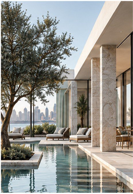
Choose Colour by Light, Material, Mood and How You Live
Interior design color schemes work when the wall colour, timber, stone, upholstery, curtains, lighting and artwork are chosen as one system rather than as separate samples. Bella develops colour schemes for Abu Dhabi homes and commercial interiors by testing undertones against real daylight, linking rooms through repeated tones, deciding where colour should dominate and where the eye needs rest, and coordinating the palette with furniture and finishes so the result still feels right after the paint dries.
You do not need to arrive with a perfect interior design color theme. Show us the colours you are drawn to, the materials already fixed, the rooms you want brighter or more intimate and the pieces you intend to keep. We turn those inputs into buildable interior design color combinations with paint, material and furnishing relationships that suit the property.

How Interior Design Color Schemes Actually Work
Interior design color schemes coordinate the dominant colour of the room with secondary materials and smaller accents so walls, furniture, timber, stone, metal, textiles and art feel intentionally related. Bella starts with fixed conditions first—flooring, stone, existing joinery, window orientation and furniture you are keeping—then builds the paint and furnishing palette around those realities instead of choosing a fashionable wall colour in isolation.
The 2026 colour landscape is unusually broad. Pantone selected Cloud Dancer, an airy white; Sherwin-Williams selected Universal Khaki, a mid-tone neutral; Benjamin Moore selected Silhouette, a deep espresso-charcoal; and Behr's 2026 direction includes the grounding blue-green Hidden Gem. At the same time, current interiors are using burgundy, olive, brown, aubergine, ochre and colour drenching. We treat these as evidence that personal, layered palettes are replacing one-size-fits-all grey—not as instructions to use every trend in your property.
A useful starting point is the 60-30-10 guideline: roughly 60% dominant colour, 30% supporting colour and 10% accent. It is not a law. A monochromatic room can use three strengths of the same hue, while an art-led room may use a quiet 80% background and let the final 20% come from furniture and artwork. The correct ratio depends on room size, daylight, material and how visually calm or expressive you want the space to feel.
If you want the colour strategy coordinated with the full interior rather than selected after furniture and finishes are already fixed, our Professional Interior Designers in Abu Dhabi approach can connect colour to space planning, lighting, joinery, furniture, fit-out and final styling.
The Colour Planning Logic
We test the palette as part of the room, not on a screen. Undertone, light, finish and the size of each colour field all change the result.
Flooring, stone, timber, kitchen fronts and large furniture often cost more to change than paint. Their undertones should guide the wall and textile palette instead of being forced to fit a colour chosen first.
Two beiges can look completely different beside the same marble or oak. We compare undertones—yellow, pink, green, grey or red—so large surfaces do not fight one another.
Abu Dhabi's strong daylight can wash out pale colour and intensify warmer tones. We sample on the real wall and check morning, afternoon and evening conditions before final approval.
A dominant background, supporting furniture/material colour and smaller accent can create order, but the proportions should change when artwork, stone or built joinery already carries strong colour.
Open-plan homes feel more coherent when one or two bridge tones repeat in different strengths. A warm khaki in the living room might reappear as curtain colour, cabinetry or a muted bedroom textile rather than identical paint.
Warm 2700K–3000K lighting makes cream, wood and red feel richer; cooler light can sharpen blue, grey and green. We assess the palette under the actual lighting specification rather than only under showroom lights.
Interior Design Color Combinations
These are starting systems rather than fixed recipes. We adjust saturation, undertone and material according to the room and your existing finishes.
Warm white, khaki, mushroom, oak and soft charcoal create a calm base with more depth than flat beige. This direction works well when stone, timber and art need to remain the visual focus.

Muted olive, terracotta, cream and warm wood create a grounded palette that works with plants, stone and tactile fabrics. Use olive as the supporting tone and clay in smaller accents when the room already has strong timber.

Deep burgundy, espresso brown, warm cream and brass create a sophisticated palette for dining rooms, studies and formal living. One saturated colour should lead while the other dark tone grounds the furniture or joinery.
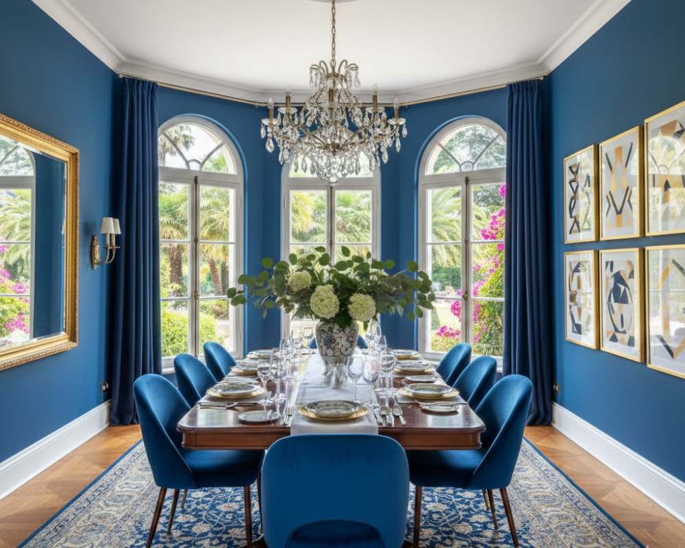
Powder or mid blue paired with sand, warm white and timber creates a fresher scheme suited to waterfront homes. Deeper blue can be used in dining or cabinetry while lighter tones keep living areas open.
How to Distribute Colour Through a Room
We plan colour by surface area and sightline. Walls are only one part of the palette; ceilings, doors, curtains, rugs, cabinetry and furniture all contribute.
Use a dominant background for roughly 60% of the visual field, a supporting colour/material for around 30%, and a more concentrated accent for the final 10%. Change the ratio when architecture or art already dominates.
Living, dining and kitchen do not need identical walls. Repeat one undertone—such as khaki, oak or soft green—through cabinetry, rugs or curtains so the zones feel connected.
Painting walls, trim, doors and sometimes the ceiling in one hue or closely related tones can make a room feel enveloping. It works especially well in studies, powder rooms and bedrooms where a stronger mood is appropriate.
A ceiling can stay light to preserve height, match the wall for a cocooning effect or carry a subtle tint that makes moulding and lighting feel more deliberate. We test this against ceiling height and natural light.
A room usually feels stronger when the accent appears in two or three meaningful places—an artwork, chair and cushion group—rather than being scattered in many tiny objects.
A home can move from lighter public spaces to deeper private rooms while maintaining common undertones. The transition should feel intentional when doors are open and multiple rooms are visible at once.
Colour + Material Undertones
Material colour is often more complex than a paint swatch because grain, veining and sheen introduce several undertones at once.
Pale oak usually supports warm whites, soft greens and dusty blues; walnut works naturally with cream, burgundy, olive, espresso and brass. We compare the actual sample because stain and veneer batch change undertones.
Marble, travertine and porcelain may contain grey, beige, pink, gold or green undertones. Wall paint should normally support the stone's quieter undertone rather than matching its strongest vein.
Warm brass pairs naturally with clay, olive, brown and cream. Chrome or polished nickel can sharpen blue, grey, white and deep green. Mixed metals work when one remains dominant.
A large green sofa or burgundy curtain is not a small accent. We include the real surface area of textiles when balancing the palette.
Higher sheen reflects more light and can make colour appear stronger while highlighting surface defects. Matte finishes feel softer but need the correct product where washability matters.
When you already own important art, we can pull quieter background or accent tones from the work and build walls, furniture and rugs around it instead of selecting paint first.
2026 Interior Design Color Theme References
These HEX values are design-screen references, not manufacturer paint specifications. Actual paint colour must be sampled physically because brand formulas, sheen, substrate and Abu Dhabi daylight change the final appearance.
An airy warm-white reference for walls and ceilings when you want brightness without a stark blue cast.
A mid-tone neutral for walls, cabinetry or upholstery that creates more depth than beige while remaining flexible.
A deep brown-charcoal for studies, joinery, doors or colour-drenched rooms.
A grounding green for living rooms, cabinetry, upholstery or a nature-led secondary colour.
A rich red for dining, velvet seating, rugs or smaller accents where warmth and drama are wanted.
An earthy accent for feature paint, textiles, pottery or warm secondary zones.
A soft cool colour for bedrooms, children's rooms or waterfront interiors balanced by warm timber.
A blue-green for cabinetry, studies or feature rooms that need colour with depth.
A warm golden accent that works with cream, burgundy, teal, brown and natural timber.
Interior Design Color Schemes Room by Room
We do not apply one palette mechanically. Living areas need flexibility, bedrooms can be softer or deeper, kitchens must coordinate with fixed finishes and bathrooms are strongly affected by tile and mirror reflection.
Warm white, khaki, mushroom or soft green can support changing furniture over time. If the sofa or artwork is already strong, keep the wall quieter and repeat the accent elsewhere.
Burgundy, deep green, espresso, teal or saturated blue can make dining feel more intimate under warm light. The table and rug should remain visible against the wall tone.
Powder blue, sage, warm taupe and soft brown create quieter bedrooms. For a richer result, walls, trim and wardrobe can share one deeper hue with lighter bedding.
The kitchen already contains several fixed colours. We first coordinate cabinet fronts, worktop, backsplash, floor and metal finish, then choose wall and ceiling colour.
Small bathrooms can take stronger colour, but mirrors multiply it and cool LED light can change undertones. We test wall or vanity colours against the actual tile and fitting finish.
A study can support more saturated colour than an open living room. Dark walls work particularly well with timber, books and warm task lighting when enough contrast is maintained at the desk.
Interior Color Schemes Across Abu Dhabi
These are design scenarios, not fixed neighbourhood palettes. We use view, orientation, existing material and lifestyle to decide how the colours should change.
A Saadiyat home can keep the architectural envelope quiet with warm white and soft sand, then use olive, walnut or burgundy in selected furniture so art and natural material remain dominant. Strong colour is concentrated rather than spread across every wall.
Best suited to: premium villas and apartments where artwork, stone and daylight already provide strong visual content.An Al Maryah residence can take deeper espresso or charcoal in joinery, study walls or dining while cream upholstery and pale stone keep the high-rise interior refined. Teal or burgundy can appear as the controlled accent.
In an Al Reem apartment, warm white or khaki walls can keep the plan open while powder blue, sage or teal appears in one chair, rug or cabinet. Lighter ceilings and a consistent trim colour help maintain visual height.
A Yas home can use durable warm-neutral walls, olive or clay in family-room upholstery and a stronger children's-room colour where appropriate. The palette remains connected through timber and repeated soft white.
Waterfront glazing suits an airy combination of sand, warm white, pale timber and powder-to-mid blue. We test blue carefully because very cool shades can become sharper under strong natural light.
Larger Khalifa City rooms can support deeper colour without feeling cramped. Formal dining or a study can take burgundy or olive while family living stays lighter, connected through warm timber and cream.
An established Al Bateen home may already contain parquet, dark doors or older stone. Rather than forcing a new cool-grey palette, we can work with those warm materials using cream, olive, brown, blue or claret accents.
A Corniche apartment can use soft ivory or khaki on the larger surfaces, then a deeper blue, teal or espresso in dining, joinery or upholstery. Low visual contrast near the glazing keeps sea and skyline views prominent.
Color Schemes for Small Spaces
We decide whether to visually expand the room or make it intentionally cocooning. Both strategies can work when the palette is consistent.
Walls, curtains and larger furniture do not need to match, but keeping them within one warm or cool family reduces visual fragmentation.
Using the same or a closely related colour on trim and doors can remove visual interruptions and make a compact room feel calmer.
One dark chair, art piece or cabinet can add depth. Many small black, red and blue accents spread around a small room can make it feel busier.
A small study, powder room or bedroom can feel sophisticated in deep green, brown or blue when the colour is treated as a deliberate envelope rather than an attempt to make the room look larger.
Mirrors multiply colour, and large windows bring exterior blue, sand or greenery into the room. We consider those reflected colours before finalising strong walls.
A warm timber floor, beige porcelain or patterned rug can already be the 30% supporting colour. Wall paint should not be selected as if the floor were visually neutral.
Interior Design Color Scheme Cost in Abu Dhabi
If the architecture is already good, paint, curtains, upholstery and selected furniture can change the atmosphere without major construction. If the colour strategy includes new cabinetry, flooring, stone, wall finishes and lighting, the project belongs in a broader design-and-fit-out budget. We separate design, painting and wider fit-out so you can compare like with like.
The figures below are external 2026 planning references, not Bella fixed prices. Painting is commonly priced by wall area, while interior design and fit-out references are usually based on floor area. Surface preparation, premium coatings, decorative finishes, access, furniture protection and number of colours can materially change the final quotation.
Space planning, colour concept, material direction and sourcing guidance without full implementation management.
Adds developed room visuals so colour can be reviewed with furniture, material and lighting before execution.
A broader appointment from concept toward implementation coordination. Exact procurement and site services still need to be defined.
Indicative Abu Dhabi vendor band for standard two-coat interior walls including paint; wall preparation and premium finishes can increase this.
Paint, flooring, light joinery and existing layout retained. Useful when colour change is part of a wider cosmetic update.
Replacement finishes, fitted joinery, some layout change, new lighting and switching where colour is coordinated with broader construction.
Planning example using the published AED 200–300/m² design-fee range before physical work, furniture, approvals or VAT.
Current Abu Dhabi vendor guidance for standard interior painting including paint. Wall area is not the same as property floor area.
Indicative Abu Dhabi vendor range for a solid-colour feature wall; textured or specialty decorative finishes are typically higher.
Planning example using AED 400–800/m² where the work goes beyond repainting into flooring, lighting or light joinery.
Color Planning for Abu Dhabi Conditions
A palette selected only from a screen or showroom can behave very differently once it reaches the property. We test colour in the real environment.
Large south- or west-facing windows can make very pale beige or grey appear almost white. We sample larger areas and check the colour through the day before approving it.
A taupe that looks balanced in daylight can become pinker or browner under 2700K light. Lighting temperature and colour should be reviewed together.
Entry halls, children's rooms, kitchens and commercial interiors need finishes selected for cleaning as well as colour. We decide sheen and coating performance by use, not aesthetics alone.
Deep green, burgundy, blue and colour-drenched walls reveal patching and uneven application more easily. Proper filling, priming and coat count are part of achieving the intended colour.
Curtains, rugs, artwork and upholstery can fade under intense UV. The colour scheme should include shading strategy where valuable or saturated fabrics sit near glazing.
Abu Dhabi DMT's simplified 2025 procedure includes qualifying non-structural interior modifications, general maintenance and interior finishes. Structural, MEP, fire/life-safety, common-property or developer-controlled work can still require additional approvals.
Interior Color Scheme Timeline
The programme depends on whether you need a palette only, a furnishing refresh or a full fit-out. The critical step is testing the colour beside the actual materials and light.
We document flooring, stone, timber, furniture to keep, window orientation, room use and colours you already like or dislike.
We develop dominant, secondary and accent families, coordinate undertones and define which rooms should be lighter, darker or colour-drenched.
Paint samples, fabrics, timber, stone and metal are checked in the property at different times of day and under the intended artificial lighting.
For wider design scopes, key rooms are visualised and paint codes, sheen, fabric and material references are documented before procurement.
A repaint can be completed quickly; upholstery, curtains, joinery, flooring or full renovation extend the programme according to actual scope and lead times.
Interior Design Color Scheme References
Each image demonstrates one useful palette strategy: warm neutral layering, olive and earth tones, blue saturation, burgundy depth, monochromatic calm or terracotta warmth. Replace them later with Bella-owned or appropriately licensed project photography while keeping descriptive image metadata.
Layered warm neutrals rely on texture and undertone instead of high contrast, allowing furniture shape and material to become more visible.
A deeper green can act as both wall colour and upholstery when warm timber and mustard accents keep the room layered.
Using the wall and seating in the same blue family creates a stronger envelope while warm timber and brass prevent the room from feeling cold.
Deep red upholstery and dark brown walls create warmth while cream and brass provide contrast and visual relief.

Different strengths of beige, cream and timber show how a room can remain visually calm without using only one flat shade.

Clay, warm textile, timber and plants demonstrate how an earthy accent can energise a neutral base without dominating every surface.
Temporary external reference images are included for colour direction only. Replace them with Bella-owned or appropriately licensed photography before using them as permanent portfolio proof.
Compare Colour Through Different Interior Styles
These related styles help you decide whether colour should be quiet, current, layered, timber-led, formal or glamorous.

Choose Minimalist when the palette should use fewer colours, stronger tonal relationships and more negative space.
Explore style →
Choose Contemporary when colour should work with current furniture, curves, art and more trend-aware combinations.
Explore style →
Choose Traditional when cream, olive, burgundy, blue and warm timber should sit inside a more formal, patterned residential composition.
Explore style →
Choose Bohemian when terracotta, ochre, green, indigo, rugs and natural fibres should create a more relaxed layered palette.
Explore style →
Choose Wood Interior Design when the timber species and stain should become the main colour decision around which walls and textiles are built.
Explore style →
Choose Art Deco when burgundy, emerald, navy, black and metallic accents should create a richer high-contrast palette.
Explore style →Turn a Colour Palette Into a Complete Interior
Colour decisions become stronger when they are made with the furniture, lighting and fixed finishes that will actually sit beside them.
For apartments and villas where colour needs to progress coherently across living, dining, bedrooms, kitchens and circulation spaces.
For wall colours, curtains, rugs, upholstery, artwork and decorative finishes where the architecture largely stays.
For sofas, chairs, rugs, curtains, lighting and loose furniture where large colour fields come from furnishings rather than paint alone.
For refining accessories, artwork and textile accents so the final 10–20% of colour feels deliberate rather than scattered.
For selecting light levels and colour temperature that reveal paint, timber and textiles consistently during the evening.
For painted or veneered cabinetry, built-ins and custom furniture where exact colour and material coordination is part of fabrication.
For homes where colour change is tied to new floors, kitchens, bathrooms, wall finishes or lighting.
For projects where the palette needs to be carried through paint, joinery, stone, ceilings, lighting and site execution.
Interior Design Color Scheme Questions
These answers focus on the practical decisions clients make: how many colours to use, how to combine them, what is trending in 2026, how Abu Dhabi light changes colour and what the work can cost.
Interior design color schemes are coordinated relationships between wall colour, flooring, timber, stone, furniture, curtains, rugs, metal and artwork. A good scheme establishes which colour is dominant, which supports it and which appears as a smaller accent.
A color theme is the overall mood or family—such as warm neutral, earthy, coastal or jewel-toned. Interior design color combinations are the specific colours and materials used to create that theme, including their relative proportions.
It is a flexible guideline: around 60% dominant colour, 30% supporting colour and 10% accent. Designers use it as a starting point, not a rigid law. The percentages can change when stone, wood, art or patterned textiles already occupy large visual areas.
2026 is broad rather than dominated by one shade. Official selections include Pantone Cloud Dancer, Sherwin-Williams Universal Khaki and Benjamin Moore Silhouette, while current design coverage also highlights olive, burgundy, brown, ochre, blue-green and moody colour-drenched rooms.
Yes. Pantone selected the airy white Cloud Dancer for 2026, but white is being used more as a considered backdrop than as a default for every room. Warm whites are frequently paired with richer timber, green, brown, clay and art.
There is no single replacement. Warm khaki, mushroom, brown, olive, blue-green and softer warm whites are all taking over roles previously filled by cool grey because they bring more warmth and personality.
Three main colour families are often enough: dominant, secondary and accent. Patterned stone, timber and artwork may add more visible colours, so we count those before introducing additional paint shades.
Light warm neutrals and low-contrast palettes can reduce visual boundaries, but a small room does not have to be white. Keeping walls, trim and large furniture within one tonal family is often more effective than simply choosing the palest colour.
Yes. A study, bedroom or dining zone can feel more intentional in deep green, blue, brown or burgundy. We control contrast, lighting and furniture scale so the dark colour creates atmosphere instead of visual clutter.
Strong natural light can wash out pale colours and intensify warm undertones. We recommend testing large physical samples on the actual wall and checking them in morning, afternoon and evening conditions before approval.
Warm white, sand, soft khaki, olive and walnut often work well because they support stone, art and natural light. The exact palette should be based on the property's flooring, glazing and artwork rather than the neighbourhood name alone.
Current 2026 Abu Dhabi references place residential concept design around AED 150–250/m², concept plus 3D around AED 200–300/m² and broader full-service design around AED 300–500/m². These are design-service references, not paint-only rates.
Current Abu Dhabi vendor guidance commonly places standard two-coat interior wall painting including paint around AED 25–45 per m² of wall area. Surface repair, premium paint, decorative finishes, height and access can increase the price.
Usually no. Paint is easier to adjust than stone, flooring, custom joinery or an expensive sofa. We prefer to confirm the major fixed materials and furniture direction first, then select the wall colour that connects them.
Qualifying interior finishes fall within DMT's simplified minor-works framework, but the exact requirement depends on the property and scope. Structural, MEP, common-property, developer-controlled or fire/life-safety work can require additional approvals.
Send the Abu Dhabi area, property type, floor plan or room dimensions, current photos, flooring/stone/joinery samples, furniture you are keeping, colours you like or dislike, inspiration images, approximate budget and target date. Also tell us whether you need colour guidance only, furnishing, renovation or full fit-out.
Build the Palette Around Your Property, Not Around a Trend Board
Share your Abu Dhabi location, floor plan, current photos, fixed flooring or stone, furniture you are keeping, colours you like or dislike and approximate budget. We can then build the dominant, secondary and accent palette around the real space and decide whether you need colour guidance, decoration and FF&E, selected renovation or complete design and fit-out.