Interior Design Guide
Interior Design Mood Board
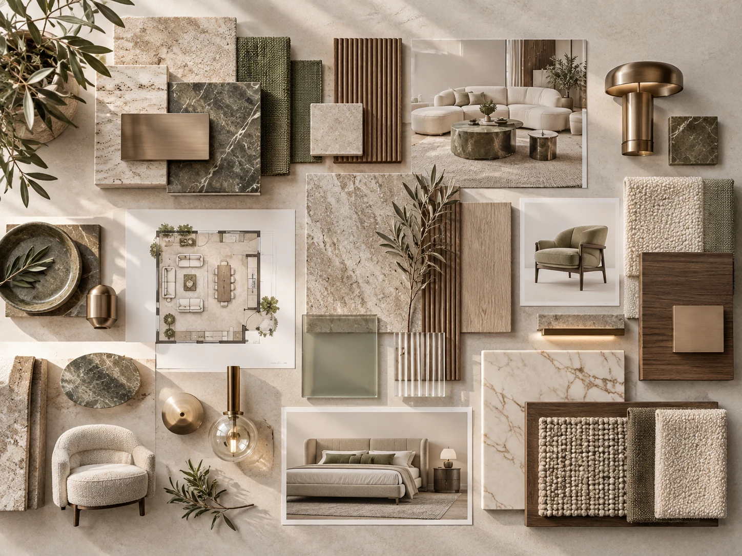
An interior design mood board is a visual decision tool that brings the proposed atmosphere, colour palette, materials, furniture character, lighting and key references for a space into one coordinated direction before detailed design begins. A good mood board is not a collage of everything you like: it should communicate one clear design idea, show which visual elements are dominant and supporting, and help you approve or reject choices before money is committed to drawings, samples, furniture or finishes. For a real project, the board should eventually move beyond digital inspiration into actual material samples, product information and room-specific decisions so the approved look can be delivered rather than merely imagined.
This guide explains what belongs on a mood board, how a mood board differs from a concept board, material board and 3D visualisation, how to build one step by step, how to use it for villas, apartments, bedrooms, bathrooms, cafés and offices, and how to turn an approved mood board into specifications without losing the original design direction.
Mood Board in One Minute
A useful mood board should make the design easier to approve—not simply prettier to look at.
If every image on the board is attractive but the client cannot tell which colours, materials, furniture shapes or lighting ideas are actually proposed, the mood board has not done its job.
Concept
The board should visually express the central design idea: what the room should feel like and which qualities matter most.
Palette
Show the main neutral base, supporting tones and any accent colours with enough hierarchy that the room does not become visually flat or chaotic.
Materials
Include representative stone, timber, metal, paint, fabric and wall-finish directions, then replace digital references with real samples as the project develops.
Furniture character
Show the intended scale, silhouette and softness of key furniture without turning the board into a full shopping list too early.
Lighting atmosphere
Communicate brightness, contrast, decorative-light character and the relationship between daylight and evening mood.
Decision hierarchy
Make clear what is essential to the direction and what is flexible so later substitutions do not accidentally change the whole design.
Definition
What Is an Interior Design Mood Board?
An interior design mood board is a curated visual presentation used to communicate the intended look, feel and material direction of an interior before every product and detail is finalised. It can combine reference interiors, colour swatches, stone, timber, metal, fabric, lighting, furniture shapes, artwork and small notes that explain how those elements relate.
The key word is curated. A mood board should reduce choices, not display every option being considered. If you place five unrelated kitchens, three different timber tones, four marble types and six furniture styles on one board, the client still has to solve the design. A good board does the opposite: it narrows the visual language enough that the project team can move forward with confidence.
Mood boards are especially useful early in design because they allow strong visual decisions to be discussed before they become expensive. It is easier to change from warm beige stone to cooler grey mineral finishes on a board than after flooring has been ordered. It is easier to decide that a room should feel softer and more residential before the ceiling, lighting and furniture packages have been developed around a harder commercial aesthetic.
Know the Difference
Mood Board vs Interior Design Concept, Material Board and 3D Visualisation
These tools overlap, but they are not interchangeable. Understanding the difference keeps approvals clear and stops a client from approving something that the designer has not actually specified.
| Tool | Main purpose | What it normally contains | What it should not be mistaken for |
|---|---|---|---|
| Interior design concept | Defines the central idea and decision logic. | Brief response, spatial principle, atmosphere and design rules. | A finished visual or a product list. |
| Mood board | Communicates the intended visual and sensory direction. | Reference imagery, palette, texture, materials, furniture and lighting character. | Final product approval or construction documentation. |
| Material board | Tests real material relationships. | Physical or accurately identified stone, timber, metal, paint, fabric and finish samples. | A purely digital collage. |
| FF&E board | Coordinates selected furniture, fixtures and equipment. | Actual or shortlisted sofas, tables, chairs, lighting, rugs, curtains and accessories. | A general concept board. |
| 3D visualisation | Tests the developed design in a specific room. | Modelled space, real proportions, materials, lighting and selected furniture. | A technical construction drawing. |
| Technical specification | Defines what is to be priced, purchased or built. | Product codes, dimensions, finishes, drawings, schedules and details. | An inspiration board. |
Board Content
What Should an Interior Design Mood Board Include?
The exact content depends on the project stage, but the board should show enough information for someone unfamiliar with the design to understand the intended atmosphere and major visual relationships. It should not need a ten-minute explanation to make sense.
- One clear concept statement or design-direction sentence.
- Two to five reference interiors selected for specific qualities rather than general attractiveness.
- A controlled colour palette with a dominant base, supporting tones and any accent colour.
- Representative flooring, wall, joinery and major surface materials.
- Timber direction, including tone and grain character where relevant.
- Metal or hardware finish direction such as brushed brass, bronze, stainless steel or blackened metal.
- Key fabric and upholstery textures for softness, pattern or acoustic character.
- Furniture silhouettes showing the intended level of formality, softness, scale and geometry.
- Decorative-lighting character and a reference for the intended evening atmosphere.
- Artwork, planting or object references only when they materially support the concept.
- Short annotations explaining why important images or materials are on the board.
Step by Step
How to Make an Interior Design Mood Board That Can Guide a Real Project
Start with the brief
Write down who uses the space, what it needs to do, the main problems, the desired atmosphere, budget level and any non-negotiable existing elements.
Choose three to five design words
Use useful qualities such as calm, warm, architectural, tactile or formal. Avoid long lists of adjectives that make almost any image seem relevant.
Collect broadly, then edit hard
Save many references privately, but only place the strongest and most consistent examples on the client-facing board.
Establish the base palette
Choose the main wall, floor, timber and textile family before selecting stronger accent materials.
Add furniture and lighting character
Show shape and scale direction without locking every product before layout, dimensions and budget have been checked.
Create visual hierarchy
Make the most important image or material larger. Supporting references should explain the main idea rather than compete for attention.
Annotate decisions
Label what matters: 'warm honed stone', 'dark oak joinery', 'soft curved seating', 'low-glare evening light'. Notes reduce ambiguity.
Replace digital references with real samples
Once direction is approved, test physical stone, timber, paint, metal and fabric under the project's actual daylight and artificial lighting.
Check budget and availability
Confirm that the materials and furniture direction can be sourced within the programme and budget before the mood board becomes the basis of detailed design.
Use the board as a filter
As new ideas appear, compare them with the approved direction. A new item should strengthen the board, not force the whole project to change identity.
Composition
How to Arrange a Mood Board So the Design Hierarchy Is Clear
The way a mood board is composed affects how it is understood. If every image is the same size, the viewer assumes every element has equal importance. That is rarely true in an interior. Flooring and joinery may establish the base; upholstery and wall finish may support it; one artwork or decorative light may provide the accent.
Use scale on the board to communicate scale in the design. A large reference image can show the overall atmosphere. Medium images can explain furniture or architectural character. Smaller swatches can show colour and detail. Leave enough white or neutral space between items that the board does not become visually noisy.
The same principle applies to colour. If a burgundy accent occupies half the mood board, the client may expect a burgundy room even if the intention is one small chair or artwork. Represent dominant and accent colours roughly in proportion to how strongly they should appear in the actual space.
Colour
How to Build a Colour Palette on an Interior Design Mood Board
Start with the largest surfaces: flooring, walls, major joinery and large upholstery. These usually create the room's visual temperature before accessories are added. Then introduce secondary colour through furniture, curtains, rugs or stone variation, followed by smaller accent colours.
Avoid choosing colour only from digital screenshots. Phone and monitor settings change hue, contrast and brightness, and the room itself changes colour further through daylight, artificial lighting and reflection from surrounding surfaces. Use the mood board to approve direction, then use real samples to approve the finish.
| Layer | Typical role | Mood-board question |
|---|---|---|
| Base | Walls, floor, major joinery, large sofa | What colour family should dominate the room? |
| Secondary | Timber, curtains, rug, occasional furniture | What adds depth without fighting the base? |
| Accent | Artwork, chair, cushion, decorative object | Where should stronger contrast or personality appear? |
| Metal / hardware | Handles, trims, lighting and fittings | Should the finish disappear, warm the scheme or create sharper contrast? |
| Natural variation | Stone veining, timber grain, handmade finish | How much movement and irregularity can the concept support? |
Materials
From Digital Mood Board to Real Material Board
A digital mood board can establish a material family, but material approval should become physical as soon as the project moves toward specification. Stone, timber, metal, paint and fabric behave differently from screen images because texture, sheen, thickness and natural variation become visible only in real light.
For example, a warm neutral mood board may use a beige natural-stone reference to establish the floor or feature-wall direction. burberry beige marble is presented as a warm classic beige marble with subtle veining suited to premium floors, walls and feature elements, so it can be a relevant sourcing reference when the approved board calls for calm, low-contrast natural stone. But the board should still move to actual sample or slab approval because natural stone varies in tone and movement.
The mood board should also describe the intended finish. Honed stone feels different from high polish. Brushed metal reads differently from mirror-polished metal. Open-grain timber veneer has a different tactile character from smooth lacquer. Those distinctions are part of the design direction, not technical details to be decided later by whoever happens to purchase the material.
Furniture + FF&E
How Much Furniture Should Appear on a Mood Board?
At concept stage, furniture should communicate character more than catalogue detail. A board may show a deep relaxed sofa, one sculptural lounge chair, a thin-legged dining table and a softly textured rug to establish the language without pretending those exact products have already been checked for dimensions, lead time and budget.
As the project develops, the furniture board becomes more specific. Actual dimensions, fabric options, suppliers, quantities and prices replace the early references. This progression is important because a mood board can make an oversized sofa look perfect when the real room cannot accommodate it.
Keep furniture references connected to the spatial concept. If the room is meant to feel open and light, heavy high-backed pieces may contradict the idea even when their upholstery matches the palette. If the space should feel intimate and conversational, a rigid perimeter arrangement may undermine the concept even if every individual item is beautiful.
Room Example
Bathroom Mood Board: Coordinating Stone, Vanity, Metal and Lighting
Bathrooms are a good test of mood-board discipline because the room contains multiple permanent finishes in a small area. The board may include floor and wall stone, vanity material, joinery tone, basin, tapware finish, mirror, decorative light and one textile reference. If all of those elements are shown as separate focal points, the finished bathroom quickly becomes busy.
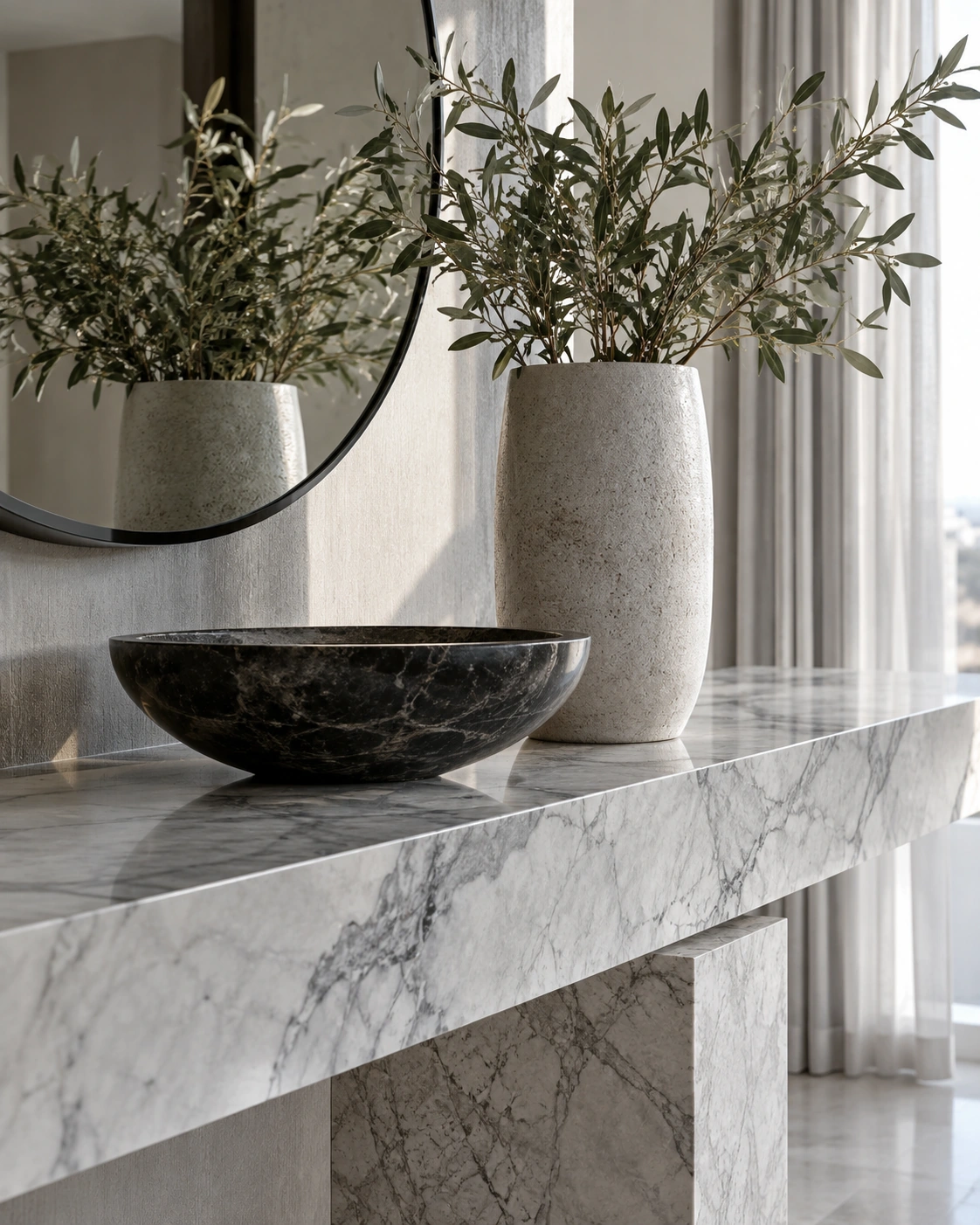
A calm bathroom concept might use one warm stone family, a quieter vanity front and a brushed-metal fitting. When the board moves into sourcing, the category of countertops for vanities becomes a practical specification decision because the surface has to work with the basin type, edge detail, tap position, splash protection and daily cleaning. Marble, granite, quartz and solid-surface options can all create different visual and maintenance outcomes even if their digital mood-board images share the same colour.
This is where the mood board protects the design: it tells the sourcing team that the vanity top is part of a warm, restrained material family, not an opportunity to introduce a completely different dramatic stone simply because it is available. The final selection can change, but it should still belong to the approved concept.

Residential Examples
Bedroom and Living Room Mood Board Examples
Residential mood boards should reflect the way each room is used, not simply repeat one palette everywhere. The home can remain coherent while individual rooms change in softness, contrast and formality.
Primary bedroom — Quiet Retreat
Board direction: upholstered headboard, warm timber, soft neutral wall tone, low-contrast rug, linen curtains and warm bedside light. Keep decorative contrast limited so the room supports rest.
Living room — Collected Contemporary
Board direction: calm mineral base, medium timber, one deeper accent colour, sculptural chair, layered rug and artwork with more personality. Furniture references should support conversation and clear circulation.
Majlis — Refined Hospitality
Board direction: controlled symmetry, richer textile, stone or timber detail, more formal lighting and carefully repeated metal finish. The board should distinguish formal hospitality from everyday family living.
Apartment — Light Urban Calm
Board direction: visually lighter furniture, fewer finish changes, concealed storage, warmer neutrals and limited pattern so a compact space feels connected rather than over-decorated.
Whole-Home Direction
How to Use Mood Boards Across a Villa Without Making Every Room Identical
Large homes need a hierarchy of boards. One whole-home concept board can establish the common design language—perhaps warm stone, dark timber, brushed bronze and soft neutral walls—while room-specific boards adjust furniture, textiles, accent colours and lighting.
The entrance, majlis, family living room, dining room and primary bedroom do not need identical furniture. They need shared design DNA. A repeated timber tone, metal family, stone language or architectural detail can connect rooms while allowing the majlis to feel more formal and the family room more relaxed.
This approach also improves procurement. Without an overall material hierarchy, different rooms can accidentally introduce five beige stones, four brass finishes and several incompatible timber colours. The whole-home board helps reduce unnecessary variation before room-level decisions become detailed.
Commercial Interiors
Mood Boards for Cafés, Offices, Retail and Customer-Facing Spaces
Commercial mood boards need to communicate brand and operation at the same time. A café board can show material warmth and graphic identity, but it also needs to anticipate cleaning, traffic and lighting. An office board may express professionalism or creativity, but the materials should still support acoustics, durability and maintenance.
For retail, the product should remain more important than the interior. A mood board that uses too many strong wall finishes, floor patterns and decorative lights can compete with merchandise. For hospitality, the board may deliberately use stronger atmosphere, but guest comfort and operational durability still have to sit behind the imagery.
| Project | Mood-board focus | Operational check |
|---|---|---|
| Café / restaurant | Atmosphere, brand, counter material, furniture, lighting | Cleaning, service flow, seating density, acoustic comfort |
| Office | Brand tone, workplace character, material durability, lighting | Acoustics, desk density, meetings, technology, maintenance |
| Retail | Product backdrop, display language, lighting, circulation | Flexibility, stock, customer flow, changing campaigns |
| Salon / spa | Customer mood, mirror/lighting character, privacy, finishes | Water, chemicals, cleaning, storage, service sequence |
| Hospitality | Arrival, room atmosphere, tactile materials, lighting | Guest turnover, maintenance, luggage, housekeeping, durability |
UAE Context
How a Mood Board Should Change for an Abu Dhabi or UAE Project
The mood-board process is universal, but UAE conditions can change how digital references are interpreted. Strong daylight can make pale stone brighter, deepen contrast in dark timber and expose differences between warm and cool whites. Air-conditioned interiors, large glazing, dust, family hospitality patterns and the range of imported and locally available materials should all influence the final direction.
If you are building a mood board for an actual local property, our interior design Abu Dhabi homepage shows how Bella connects design direction with residential and commercial project scope in its home market. The link is relevant at this stage because the mood board should eventually move into space planning, materials, technical coordination and delivery—not remain an isolated inspiration exercise.
For a villa, the board may need to distinguish formal guest spaces from family areas while keeping one material language. For a high-rise apartment, window views and daylight may be important enough to keep the palette quieter. For a commercial project, landlord or building requirements can affect ceilings, services and permitted materials, so the mood board should not promise an effect that cannot be technically delivered.
Budget + Procurement
How to Keep a Mood Board Realistic for Budget and Availability
A mood board becomes dangerous when it creates expectations the project cannot afford. If every reference uses rare stone, fully bespoke furniture, handmade plaster and imported lighting, a mid-range budget will either fail or be forced into weak imitations.
The better approach is to define which elements carry the concept. Perhaps the natural stone floor and one bespoke joinery feature matter most, while secondary furniture can come from standard suppliers. Or the project may keep a simpler floor and invest in lighting and artwork because atmosphere is more important than material richness.
Availability matters too. A board prepared around a discontinued fabric or a twelve-month furniture lead time is not helpful for a project opening in twelve weeks. Once the visual direction is approved, the design team should verify suppliers, lead times, quantities and acceptable alternatives before the project relies on those selections.
- Label reference images as direction unless the exact product has been checked.
- Identify concept-defining materials that should receive priority budget.
- Keep at least one acceptable alternative for long-lead or uncertain products.
- Check minimum order quantities for fabric, stone, special finishes and custom items.
- Confirm whether installation, substrate, edge details or accessories add material cost beyond the visible product.
- Update the board or schedule when an approved substitution changes colour, texture or visual weight.
Next Stage
What Happens After the Mood Board Is Approved?
Approval of the mood board should not mean 'buy everything shown.' It means the design direction is clear enough to move into detailed decisions. The next stage normally includes space planning refinement, actual material samples, furniture selection, lighting design, joinery development, 3D visualisation where useful, and technical documentation appropriate to the project.
The mood board remains a reference during those stages. If the final sofa is different from the inspiration image, it should still have the right scale, softness and colour relationship. If the exact stone becomes unavailable, the alternative should preserve the intended warmth, movement and finish rather than simply match the price.
This is why a mood board should contain enough logic to survive substitutions. The board is successful when the finished room feels like the approved direction even though some individual products may have changed.
Decision Criteria
Interior Design Mood Board Approval Checklist
Before approving the board, do not ask only 'Do I like it?' Use the questions below to check whether the direction is specific enough to guide a real project.
| Question | Ready to approve | Needs more work |
|---|---|---|
| Can you describe the room in one sentence? | The atmosphere and main material direction are clear. | The board contains several unrelated styles. |
| Is the colour hierarchy clear? | You can identify base, secondary and accent colours. | Every swatch appears equally important. |
| Do the materials belong together? | Stone, timber, metal and fabric create intentional contrast. | Each material looks attractive alone but conflicts as a group. |
| Does furniture suit the room? | The character supports the layout and desired formality. | Furniture is selected only because it looks fashionable. |
| Does lighting support the mood? | The board communicates daylight and evening atmosphere. | Lighting is represented only by decorative fixtures. |
| Can the budget support the direction? | Premium elements are prioritised and alternatives are possible. | The board depends on expensive references with no realistic sourcing plan. |
| Can the design be maintained? | Surfaces and fabrics suit real use and cleaning. | Maintenance has not been considered. |
| Can the team explain what is flexible? | Core design rules and replaceable details are understood. | Any product substitution would change the entire look. |
Common Mistakes
Interior Design Mood Board Mistakes That Create Generic or Misleading Results
Collecting instead of editing
A board with too many references transfers the design decision back to the client instead of presenting a direction.
Using only complete-room images
Full-room references can hide which exact quality is being proposed. Add material, colour and detail references so the intention is explicit.
Mixing multiple timber and metal tones accidentally
Variation can be intentional, but unplanned combinations often make the final room look less resolved than the board.
Approving digital stone as if it were the real slab
Natural stone varies. Use the image for direction, then approve actual samples or slabs where variation materially affects the design.
Ignoring scale
A dramatic pendant, deep sofa or oversized coffee table can look perfect on a board and completely wrong in a compact room.
Treating the board as a shopping list
Early references establish character. Actual products still need dimension, price, lead-time and availability checks.
Making every element a focal point
A strong mood board needs hierarchy. If stone, joinery, furniture, light and art all compete, the final room will too.
Never updating the board after substitutions
If several approved items change, review the combined palette again so incremental substitutions do not move the project away from the original direction.
Bella Project Insight
How Mood-Board Thinking Appears in Real Project Decisions
Bella's published project studies are useful here because each one identifies a challenge and design response. A strong mood board would support those responses by visually defining the atmosphere and material hierarchy before individual finishes and furniture are approved.
Open Living, Connected Spaces
A generous living and dining zone needed to feel connected enough for family life and entertaining, while still giving each activity a clear place and keeping movement through the room effortless.
We used furniture zoning, a restrained material palette and strong architectural sightlines to define living, dining and circulation without adding visual barriers. Lighting and joinery were treated as part of the layout so the room feels composed from every approach.
A Majlis Built Around Conversation
The room needed generous hospitality seating while protecting privacy, maintaining comfortable circulation and keeping the courtyard connection present without turning the majlis into a passage space.
We organised the seating around face-to-face conversation, kept primary circulation to the perimeter and used screened openings to filter views and sunlight. The result is a room that supports both larger gatherings and quieter everyday use.
City Views, Better After Dark
The main living volume needed to make the most of panoramic glazing while remaining warm, legible and visually balanced at night, when reflections and artificial light become more prominent.
We layered architectural and decorative lighting, used deeper timber and stone tones to give the room visual weight, and treated the stair and vertical volume as part of the composition rather than background circulation.
The Takeaway
A Mood Board Is Successful When the Finished Room Still Feels Like the Board Without Copying It Literally
An interior design mood board should give you confidence about direction before the project becomes detailed. It should show enough colour, material, furniture and lighting information to make the design understandable, but it should leave room for real products, samples, technical requirements and budget to refine the result.
The best boards are therefore not the busiest or most beautiful presentations. They are the ones that make later decisions easier. If the project team can use the board to judge a new stone, sofa, curtain, light or paint colour consistently, the mood board has become a working design tool rather than an inspiration collage.
Continue Learning
Related interior design guides
Only guides already published in the database will appear here. Planned guide URLs remain hidden until their own Blog Detail page is published.
What Is Interior Design?
What is interior design? Learn its meaning, scope, process, difference from decoration, FF&E, costs, common mistakes and practical UAE examples.
→ Trends & InspirationInterior Design Trends
Interior design trends 2026: warm natural materials, curves, richer colour, biophilic design and flexible spaces, with practical UAE examples.
→ Start HereInterior Design Concepts
Interior design concepts explained: turn a brief into layout, materials, lighting and furniture with practical home, café, commercial and UAE examples.
→ Materials & DetailsInterior Design Materials
Compare interior design materials including stone, timber, metal, glass, porcelain, fabrics and countertops by use, maintenance and UAE conditions.
→Frequently Asked Questions
Interior Design Mood Board — FAQs
What is an interior design mood board?
An interior design mood board is a curated visual presentation that communicates the intended atmosphere, colour palette, materials, furniture character and lighting direction of a space before every product and technical detail is finalised.
What should be included in an interior design mood board?
A useful mood board normally includes a short concept statement, selected reference interiors, colour palette, representative stone, timber, metal and fabric, furniture silhouettes, decorative-lighting character and annotations explaining the most important design decisions.
What is the difference between a mood board and a concept board?
The design concept is the underlying idea and decision logic. A mood board visually expresses that concept through images, colour, texture, furniture and materials. In practice the terms can overlap, but the concept should explain why the visual direction exists.
Is a material board the same as a mood board?
No. A mood board can include material references, but a material board usually develops into actual or accurately identified physical samples of stone, timber, paint, metal, fabric and other finishes used for real specification and approval.
Can I make an interior design mood board myself?
Yes. Start with the brief, choose a few design words, collect references, edit them into one direction and establish colour, material, furniture and lighting hierarchy. The challenge is not collecting images; it is removing the ones that do not support the same idea.
How many images should be on a mood board?
There is no fixed number. Use enough to communicate the direction without creating ambiguity. A focused board with a small number of deliberate images and material references is usually more useful than a collage containing dozens of unrelated interiors.
Should exact products be shown on a mood board?
They can be, but early boards often use references to establish character. Exact products should only be treated as approved selections after dimensions, price, lead time, availability and compatibility with the room have been checked.
Does a mood board include flooring and countertops?
Yes, when those surfaces materially affect the design direction. Large surfaces such as flooring, stone walls, vanity countertops and major joinery often establish the room's visual base, so they should be represented early and then confirmed with real samples.
What happens after a mood board is approved?
The project normally moves into more specific space planning, actual material samples, furniture selection, lighting development, 3D visualisation where useful, joinery and technical information, procurement and other stages appropriate to the agreed scope.
How do I know if a mood board is good?
A good mood board has one clear direction, visible hierarchy, compatible materials and colours, furniture suited to the intended atmosphere and enough practical realism that the direction can survive budget, availability, maintenance and technical development.
References
Sources & further reading
Professional definitions and specialist references used to support or verify specific points in this guide.
Have References but No Clear Direction?
Send us what you like—and tell us what the property actually needs.
If you already have a villa, apartment or commercial space and a folder of references, share the location, floor plan or approximate area, current photos, the images you keep returning to, what is not working now, target timing and budget range if known. Bella can help turn that collection into a mood board and design direction that belongs to the property instead of copying someone else's room.